| |
|
| |
In this survey a series
of similar looking charts
will be presented. We would like you to respond to the
following questions. |
| |
|
| |
1.
Pick
the chart that is most
unlike the others
2. Reasons for your choice
3. How certain are you?
(1= most, 5= least)
4. Your
Nick Name (or ID) |
| |
Finally we would like to collect some information about you.
(age category, education and gender)
|
| |
|
|
 |
|
Welcome to the
survey on graphical inference |
|
|
This web site is designed to conduct a survey on
graphical inference
which will help us understand the power of graphical inference
procedure in the field of statistical research. |
This research is being conducted by Mahbubul Majumder under the
supervision of Dr. Cook and Dr. Hofmann, Department of Statistics,
Iowa State University, funded in parts by NSF grant DMS 1007697. If you have any questions please contact Mahbubul by email to mahbub72@gmail.com.
The following examples illustrate how
you may respond to the survey questions. |
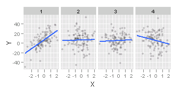
Example 1:
Of the scatter plots below which one
shows the data
that has steepest slope?

Your choice:
Plot 1 (the first one)
Reasoning:
Most tilted blue line or least horizontal line or trend of the points.
How certain are you on a scale of 1 to 5
(1= most
certain, 5= least certain):
1
Your Nick Name: Mahbub |
|
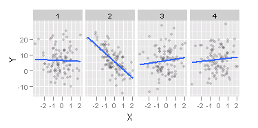
Example 2:
Of the scatter plots below which one
shows the data
that has steepest slope?

Your choice: :
Plot
2 (the
third one)
Reasoning:
Most tilted blue line or least horizontal line or trend of the points.
How certain are you on a scale of 1 to 5
(1= most
certain, 5= least certain): 1
Your Nick Name: Jane |
|